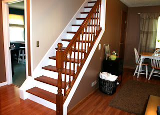
Over the long Labor Day weekend, we tackled more than one project around the house. I felt like we were that couple on the Lowe's commercial, painting and fixing things with big smiles on their faces. While we were giving the staircase and walls a makeover, it was my idea to paint the sitting room while we were at it. 9 times out of 10, I'm the one scheming up new projects to do around the house. My husband loves it. [insert chuckle of laughter]
If you remember from an earlier post, our sitting room was a light green. I was a little over-zealous in selecting multiple colors for every room in our house when we first moved in, and green was already there. The more I thought about it, the more the green didn't really fit and I'd rather have it go with the rest of the first floor color palette. Continue the flow. I had one of those "duh" moments. Why didn't I do this in the first place? Here's a look back at the before.
I guess I was a little worried about having too much brown, particularly because it is a small room. But it does get good light. I scoped out some brown rooms to see what I was picturing in my mind. I was inspired by the dark cozy brown, accented with white pieces of furniture, artwork and accessories.
We painted the sitting room "Nuthatch" brown, a continuation of the color from our living room. It was kind of a no-brainer and I love how it looks! We had enough paint in our basement, so this was another "free" project! Yes! I did a lot of rolling while my husband did all the cutting.
And of course, I moved the furniture around. Again. This room has always been a challenge for me. I just couldn't settle on an arrangement I was totally happy with. I am much more happy with this set up. At last! For now. I'm sure I'll think of something to move in 6 months. We moved one of the shelf towers from the living room, into this corner for a little visual interest. The love seat is now in from of the bay window, instead of against the far wall. I can't tell you how much more inviting it looks.
Here's the opposite view, facing our new stairs. I moved the wooden file box and basket of blankets to that side. It fills the little space on the odd shaped triangular wall nicely.
And our table and chairs on the back wall, in front of the tall narrow window. We already tried it out for a game night.
I always wanted to add some type of window treatment to this non-centered window but couldn't decide what to put there. It had a custom fit shade but looked boring and unfinished.
I was thinking of making two panels myself if I could find a fabric that I liked. Nothing was really standing out to me. I wanted something with a little color or texture but wouldn't stand out like a sore thumb. While I was shopping around, I found these tan and cream chevron and solid panels with a fold over button design. They were in the clearance section at Burlington Coat Factory for $6.99 each! Made of heavyweight fabric, almost a tweed, I couldn't walk away from them. I liked the pattern and the price!
I found a curtain rod in our basement that we weren't using and recruited my husband to help me hang it up. This was the perfect opportunity to try a little trick I saw on Young House Love. I wanted to create the illusion that the window is in the center of the wall by cheating the curtains a little to the right, to make up for the extra space. We did this by extending the curtain rod farther out on the right side.
Having the curtains centered, even though the window is not, created more balance and symmetry in the room. Gotta love symmetry!
I ended up removing the shade from the window completely, because it just didn't look right with the new curtains. I like how much light the window lets in now. Doesn't it look better? Not bad for a $12 solution! Makes me want to sit at the table with some hot chocolate and do a puzzle.
I really like my chocolate room! That's what I've named it. Who doesn't like chocolate?


Hi, I agree with you that painting the room with brown is a bit risky because it won't reflect the natural light around which is a must if the room is smaller. I see that you have some furniture white in color to make a contrast. That's a nice move :) Thanks for sharing the photos, really enjoyed.
ReplyDelete