Wednesday, September 28, 2011

Wegmans Brand Packaging


I am frequently asked by friends and family, about projects I've been working on at work. I am part of a team of graphic designers, specifically focused on Wegmans brand packaging. This involves designing and redesigning both new and existing products throughout Wegmans 75+ grocery stores. I like the variety of working on both food and non-food packaging. One day it could be steak sauce, the next it could be bath tissue. 

Wegmans recently opened their newest store in Bel Air, Maryland. It's always exciting to see Wegmans brand products on display for a new store opening. My co-worker, Michelle, was kind enough to share her photos. She got some good ones! 


The following is a look at a few of the Wegmans brand products our team has worked on and that I got to play a part in designing.


It's still always cool to see something I worked so closely on, in store, on display for all to see. Sometimes while shopping, I get a surreal feeling, like I'm at an art show with my work all over the walls, out there for people to like or dislike. Kinda crazy. If you'd like to know more about what I do, here's an earlier post about my job as a packaging designer.

Thank you to Michelle Freas for the use of these photos

Tuesday, September 27, 2011

Look Who's...


Today is the second anniversary of the day I started blogging, here at Sohl Design. 260 posts later...wow! This has become such a fun creative outlet for me. I really enjoy it. I like sharing projects that I'm proud of, my favorite recipes and celebrating time spent with my family and friends. I know in blog land, they tell you not to look at your stats or fool yourself into thinking that people care about your little 'ol blog, which is one of millions out there, or that people actually read it. But I can't tell you how encouraging it is when I get emails from you, or you tell me in person that you liked something you saw on Sohl Design. I get a happy butterfly feeling and it brings a huge smile to my day. It makes me feel like in some small way I've connected with you, or shared something worthwhile or maybe even inspired you to try something new. I gobble up your comments like the last piece of chocolate cake. And when I do look at audience stats ('cause I can't help it), it blows my mind that someone in Ireland (Mairead?), Australia, India, or even South Korea would be interested in what I have to say.

So, I want to say to each of you, wherever you are, from the bottom of my heart, thank you for taking an interest in Sohl Design, for cheering me on and for being a blessing to me! Here's to another year of Sohl Design! 


xoxo

Sunday, September 25, 2011

Sitting Room Turned Chocolate Room

Over the long Labor Day weekend, we tackled more than one project around the house. I felt like we were that couple on the Lowe's commercial, painting and fixing things with big smiles on their faces. While we were giving the staircase and walls a makeover, it was my idea to paint the sitting room while we were at it. 9 times out of 10, I'm the one scheming up new projects to do around the house. My husband loves it. [insert chuckle of laughter]

If you remember from an earlier post, our sitting room was a light green. I was a little over-zealous in selecting multiple colors for every room in our house when we first moved in, and green was already there. The more I thought about it, the more the green didn't really fit and I'd rather have it go with the rest of the first floor color palette. Continue the flow. I had one of those "duh" moments. Why didn't I do this in the first place? Here's a look back at the before.


I guess I was a little worried about having too much brown, particularly because it is a small room. But it does get good light. I scoped out some brown rooms to see what I was picturing in my mind. I was inspired by the dark cozy brown, accented with white pieces of furniture, artwork and accessories.


We painted the sitting room "Nuthatch" brown, a continuation of the color from our living room. It was kind of a no-brainer and I love how it looks! We had enough paint in our basement, so this was another "free" project! Yes! I did a lot of rolling while my husband did all the cutting. 

And of course, I moved the furniture around. Again. This room has always been a challenge for me. I just couldn't settle on an arrangement I was totally happy with. I am much more happy with this set up. At last! For now. I'm sure I'll think of something to move in 6 months. We moved one of the shelf towers from the living room, into this corner for a little visual interest. The love seat is now in from of the bay window, instead of against the far wall. I can't tell you how much more inviting it looks. 


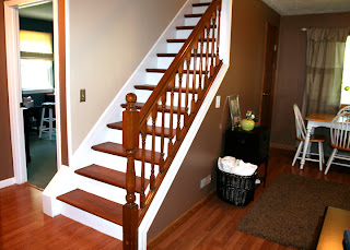
Here's the opposite view, facing our new stairs. I moved the wooden file box and basket of blankets to that side. It fills the little space on the odd shaped triangular wall nicely. 


And our table and chairs on the back wall, in front of the tall narrow window. We already tried it out for a game night. 


I always wanted to add some type of window treatment to this non-centered window but couldn't decide  what to put there. It had a custom fit shade but looked boring and unfinished. 

I was thinking of making two panels myself if I could find a fabric that I liked. Nothing was really standing out to me. I wanted something with a little color or texture but wouldn't stand out like a sore thumb. While I was shopping around, I found these tan and cream chevron and solid panels with a fold over button design. They were in the clearance section at Burlington Coat Factory for $6.99 each! Made of heavyweight fabric, almost a tweed, I couldn't walk away from them. I liked the pattern and the price!


I found a curtain rod in our basement that we weren't using and recruited my husband to help me hang it up. This was the perfect opportunity to try a little trick I saw on Young House Love. I wanted to create the illusion that the window is in the center of the wall by cheating the curtains a little to the right, to make up for the extra space. We did this by extending the curtain rod farther out on the right side. 


Having the curtains centered, even though the window is not, created more balance and symmetry in the room. Gotta love symmetry!


I ended up removing the shade from the window completely, because it just didn't look right with the new curtains. I like how much light the window lets in now. Doesn't it look better? Not bad for a $12 solution! Makes me want to sit at the table with some hot chocolate and do a puzzle.


I really like my chocolate room! That's what I've named it. Who doesn't like chocolate?

Baja Fish Tacos

I'll be the first to admit that the thought of fish tacos initially did not sound appealing to me. In fact, I've never had one until Andrew made them for me last week. I was curious to see what they were like. Andrew had them when he was in Los Angeles a couple years ago and really liked them. He found a recipe on foodnetwork.com and decided to try it. I'm thrilled when my husband wants to tackle meal preparation! They were actually very tasty and the white sauce is what made them so good. We cut the food network recipe in half and modified a few things. Here's how we made them:


Ingredients:

White Sauce:
1/2 cup mayonnaise 
2 Tbsp. milk
2 Tbsp. lemon juice
1/2 teaspoon garlic powder
pinch of salt

Fish Tacos:
Vegetable oil
1 package/box tempura batter mix
1/2 can beer
1/2 teaspoon salt
1/2 teaspoon garlic powder
2 large boneless talapia fillets, cut into 2-inch pieces
corn tortillas
shredded lettuce
diced tomatoes
1 lime, cut into wedges

Directions:

For the sauce:
Mix all ingredients together and set aside.
Preheat a fryer or a deep pot halfway filled with oil to 375 degrees F.
Mix half of the package of batter, but only use 1/2 the required amount of water and use beer for the remaining amount instead. Add the beer until the batter becomes almost like a heavy cream consistency.
Using the other half of the package of batter add salt and garlic powder, coat talapia pieces with the dry mix, then dip into prepared batter. Deep-fry for about 3 minutes, or until golden brown and cooked through.
Place fried talapia pieces on warmed corn tortillas, add white sauce to fish, a little shredded lettuce, tomato and a squeeze of lime, to taste.


Andrew and I were extremely impressed with his new found deep frying skills. He didn't stop raving about his own meal! That was after we had to open all the windows and doors in an effort to air out the cloud of smoke from the burning hot oil. Lesson learned! Our house is just returning to it's normal scent, 6 days later. Haha! I've been bumping up the air freshener. 

These fish tacos were a delicious new way to eat fish - and tacos. Kinda like fish nuggets you could dip into the white sauce all by themselves. If you're skeptical about fish tacos like I was, give this recipe a try. You might really like it! 

Monday, September 19, 2011

Stairway to Heaven

It's not Led Zeppelin, it's our latest home project! I am quite ecstatic to reveal our staircase "renOHLvation" if you will. Ever since we moved into our house, 4 years ago, I've thought about removing the carpet from the stairs. The risk, however, was that we didn't know if there were hardwoods underneath or what condition they were in. So the shaggy old carpet stayed. Until I couldn't look at it any longer. Andrew and I agreed that we would take the risk and start ripping it off. If the stairs were in good shape, we would re-finish and paint them. If they were in bad shape, we would have new carpet installed. 

Let's take a look at the BEFORE. The walls were sponge painted a strange grayish-bluish-white when we moved in. It was hard to look at.

So we painted it a light green, along with the dining/sitting room. A choice I now question, but when we moved in, and actually had the liberty of painting an entire house whatever color(s) we wanted, I went a little crazy. I like color. What can I say? It was a nice green, it just didn't go with the rest of the house.

Take a look at this carpet in all it's speckled-shaggy-goodness.

We took the plunge and started to rip it out! Which required the use of my husbands muscles. I have no upper body strength. It's sad. 

 Bye-bye carpet! This is what we were left with. Carpet padding + 9,000 staples.

The wood didn't look half bad! Praise the Lord! It would need to be cleaned up, stained and painted, but there weren't any major defects. Phew! I could see it all coming together...


We did discover just plywood at the top of the landing. Whomp whomp. We will need to cover this spot with laminate flooring, but that is another project for another day. 

I also discovered a little piece of history. I get a big kick out of this type of stuff. See that little peach doted patch? This wallpaper used to be in the hall. How funny. 


Now for some work... 

I ripped out so many staples with these tools, my hand hurt for 2 days. See that bucket? Full of staples! I would like to thank the carpet installers of this house's past, for being so thorough and using SO MANY STAPLES. Really. Thank you. 


Once THAT was done, we had bare steps that needed to be sanded. We used a small hand sander regular sand paper. I say "we" a lot, but Andrew did the hardest work and I helped him when it was something I could handle. Or that he trusted me with. The hand sander is the most advanced power tool I use.


Once the stairs were prepped, it was time to prime the treads white and stain the wood. We used Rustoleum Ultimate Wood Stain in light walnut. 
The second step was tested first. I loved the color immediately! It was a close match to the existing bannister and not too far from the floor color.


It turned out so beautiful!
Even better than I imagined! We painted the walls our favorite light tan, "Kilim Beige" by Sherwin Williams, which was leftover from the kitchen and upstairs bathroom. We also had enough white paint for the treads from another project. The only real investment was the wood stain, clear polyurethane and our own labor. More so my husbands labor. A labor of love to make my staircase dreams come true! 


I just love the wood grain! It makes the whole hall look so fresh and bright. 


The only thing missing is this old railing. I didn't want to put it back up. Is it really necessary? No, I don't want people falling down my stairs, but it's kind of ruins the look of the smooth clean wall. I don't miss it. We're going to leave it off for now. Andrew holds to the argument that it's a house code law that you have to have a railing. If we ever do have to put it back up, it's in the garage. 


One last look at the before and after. What a difference! I couldn't be happier! Yes, the stairs are a little more creaky. Yes, they are a tad on the slippery side, compared to carpet. But does it look waaaay better? Yes! Is it funny to watch our cats run up them and occasionally slip? Yes! No. Kidding!

I owe the biggest THANK YOU EVER to my does-it-all-handy-man-husband, Andrew. You made my vision for these stairs come to life! Thank you for the many hours, hard work and sweat you invested. You are the best painter I know! And I love you for going along with my home project schemes and helping me accomplish things like this that make me happy. I love you. And I love sharing our home and working on it together.