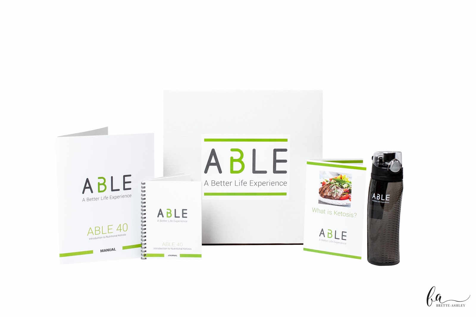
Earlier this year, I started working with ABLE, a new client and lifestyle company committed to helping people through the benefits of nutritional ketosis. I worked with them to provide design and consulting to help launch their new products and showcase their brand. I was thrilled to work with this startup company that grew from the vision of three friends, one of whom I have known since high school.
I really enjoyed working on a variety of pieces and providing input on various levels, such as:
Refining their new logo
Box kit packaging labels
Welcome kit letter
Ketosis brochure
Coupon card
Facebook ad
Water bottle branding
Supplement packaging concepts
T-shirt consulting
Web design consulting
Graphic design and packaging have been my primary focus for over a decade, but I also have experience with marketing and unique applications. I love working with new clients, especially wonderful ones like the ABLE team.
We also got to collaborate with another friend of mine and talented photographer, Brette-Ashley, to capture their product photos and head shots. It's so great when I get to work with friends who also run their own business.
To learn more, visit the ABLE website
Product photography by Brette-Ashley Photography
Showing posts with label logo design. Show all posts
Monday, July 17, 2017
Tuesday, March 8, 2011
Logo Concepts for Baby Fresh Farms
I have been doing some design work for a new local company, Baby Fresh Farms. A friend from college and his business partner contacted me about designing packaging labels, and possibly a logo, for their locally grown frozen baby food. I was thrilled at the opportunity. Although I didn't end up designing their logo, I put together a couple of concepts. The tag line was a requested component. I think they're pretty cool (in my semi-biased opinion).
The product is natural, locally grown and basically single ingredient. My rationale for the above concept was to combine clean type with fruit and vegetable icons, based on fruit and vegetable colors. Bright and fresh, yet a little playful, using block shapes, reminiscent of children's toys. Reminds me of flash cards or a memory matching game.
This concept has a bit more personality. I kept picturing little baby forks and spoons and the cute chubby hands that learn to hold them. The colors are still ingredient based - orange carrots, green beans, purple beets. The font is looser and more organic feeling. I really like the association with meal time that the spoon and fork create.
I'm looking forward to seeing the finished labels. The logo they selected is pretty adorable, I must admit. Stay tuned.
Saturday, January 15, 2011
Upstate Refreshment Services Logo Design
I have been excitedly working on some freelance design projects. I designed a logo for Upstate Refreshment Services, a food and beverage vending company. The goal was to communicate "fresh" and "refreshment" with a modern feel. I wanted to come up with a graphic to accompany the typography. The abstract shape could symbolize a variety of vending options, such as a coffee cup, a bowl, perhaps a potato chip or snack.
Here is the business card. I kept the logo in white space and placed the contact information in blue across the bottom third of the card for contrast. This was a fun project. I'm happy with how it turned out. The logo will be included on their new website when it's up and running.
Subscribe to:
Posts (Atom)


