Welcome to our home. This is where I decorate, cook, clean, organize, craft and enjoy what I am very blessed to call our first house. This is a new series I call, "Before & After Home." Who doesn't love good before and after pics? It could be a hair makeover, a restored piece of furniture, a newly painted room, or a re-purposed thrift store find. I love to see something boring, outdated, or in need of serious TLC, come to life and shine like new.
If you've been wondering what my casa looks like, now's your chance to take a virtual tour. I'm taking a look back at our house, room by room, as it was when we first moved in, and how we've transformed it into our own, over the past three years. First stop, the main entry which leads into our kitchen.
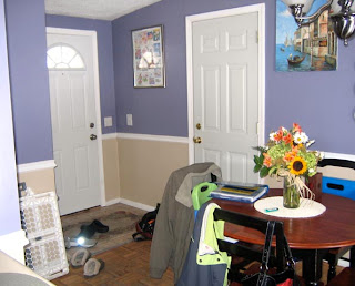
Take a look at the (purple) BEFORE (with the previous owners stuff):
The cabinets were in beautiful condition, they just needed new hardware.

I didn't mind the chair rail but the purple absolutely had to go. This was the first room we painted.

Now a look at AFTER:
Our coat closet, with a sign above that says "Delighted you came."
To the right, you see through to the rest of the house.
I always wanted a red kitchen. Red is not the easiest color to paint. Luckily, purple was a perfect "primer." My husband did an expert job, as usual.
This is our eat-in area with table and chairs handed down to us by family and refinished by my father-in-law. This room was actually added on at some point after the house was built. French doors lead out to the deck.
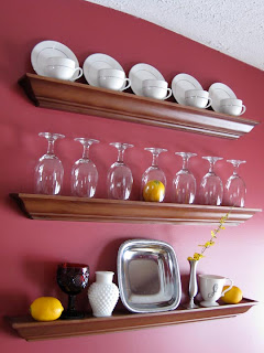
These three floating shelves used to be in our apartment. I decided to stack them here to display china and other decorative items.
This little side table nook is one of my favorite spots. The table was actually going to be thrown away by a neighbor (can you believe it?!) It adds so much character and holds some milk glass and cookbooks.
This window looks out into our big back yard. I installed new cabinet hardware and changed the window valance. We really liked the black appliances that came with the house. If you're wondering, that is a kitty door that leads to the basement.
On the other side, more cabinets, counter space and small appliances. I found some fun coffee themed canvas art for above our coffee station. As you can see, it is a walk through kitchen with entrances on both sides. We really like the openness of the floor plan.
That's a look at the "heart" of our home, where guests arrive and meals are prepared and enjoyed. I have not regretted my color choice. It completely warmed up the room. I am surprised at how much I enjoy spending time in the kitchen, cooking and baking. And eating of course.
What do you think? Like the color? Is it a good before and after?


WOW! I had never seen the "before" pictures, but you definitely made the house a home with your warm color selections and design style. If I recall, your home inspired many of the colors within our own house :)
ReplyDelete-Christy
I love a good before & after. What an impact the entrance makes those colours are a match made in heavan. Great work!
ReplyDeleteI have been looking for the right red color for my kitchen, can you tell me what brand and color that is on your walls they are perfect.
ReplyDeleteHi there! The red we used is "Kirsch Red" by Sherwin Williams, Interior Duration Ultradeep Base Satin Latex paint. My husband worked at Sherwin Williams, so he used a high quality paint that would cover really well, especially when painting red. It's definitely worth the investment if you're looking for that "perfect" red. If you use an inexpensive paint, you'll probably end up needing many, many coats, and it may not cover as well. Best of luck - I would love to see photos!
Delete